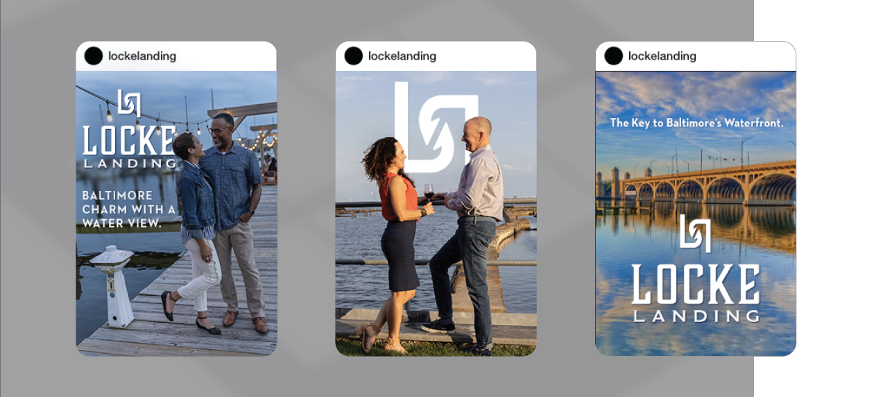
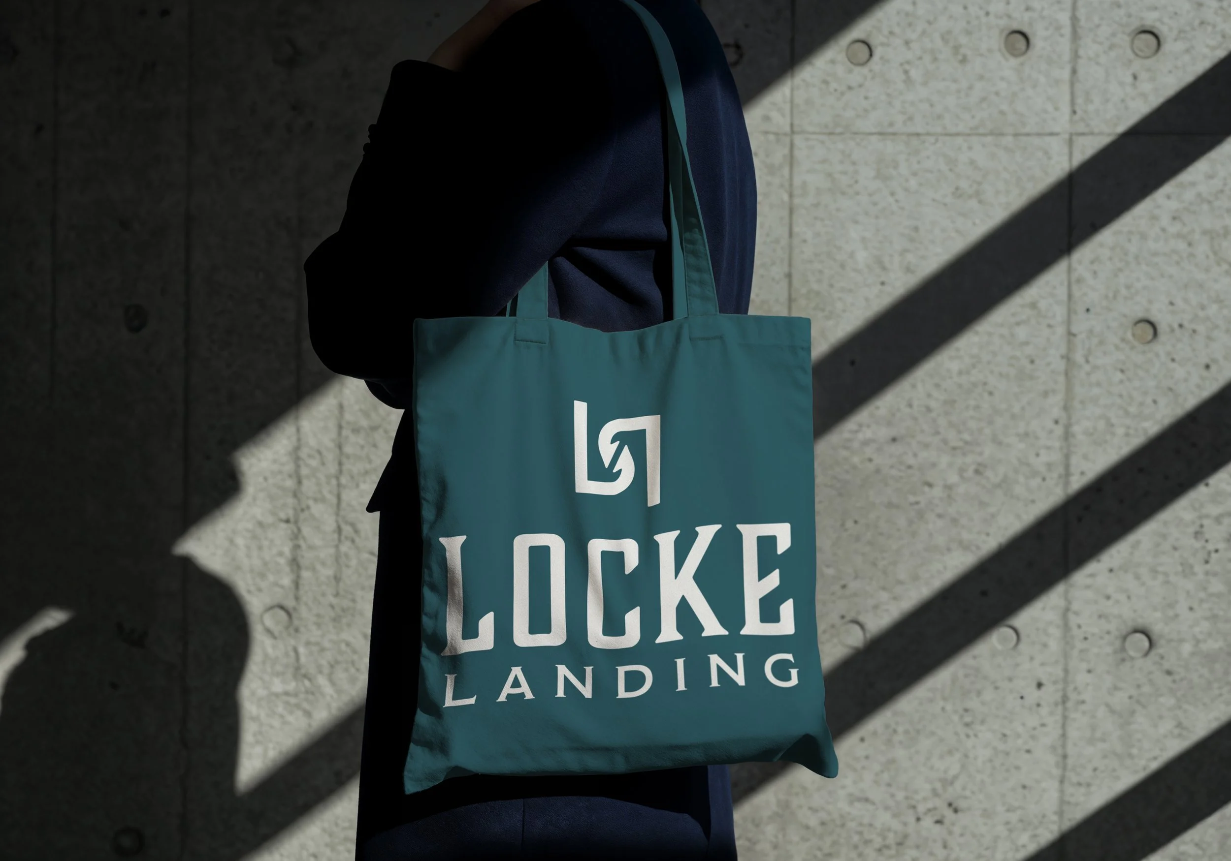
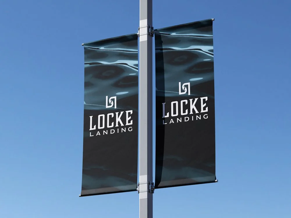
Logo Design
In order to market this new community of homes by two established homebuilders in Baltimore’s restored waterfront Peninsula, this client sought out the creation of a strong, identifiable mark.
The font pairings were carefully chosen to connote the community’s historical “industrial deco,” a characteristic that nods to the location’s past and architectural charm. The wordmark grounds the icon; two stylized, interlocking “L” shapes that resemble fish hooks symbolize the connectivity of the Baltimore Peninsula.