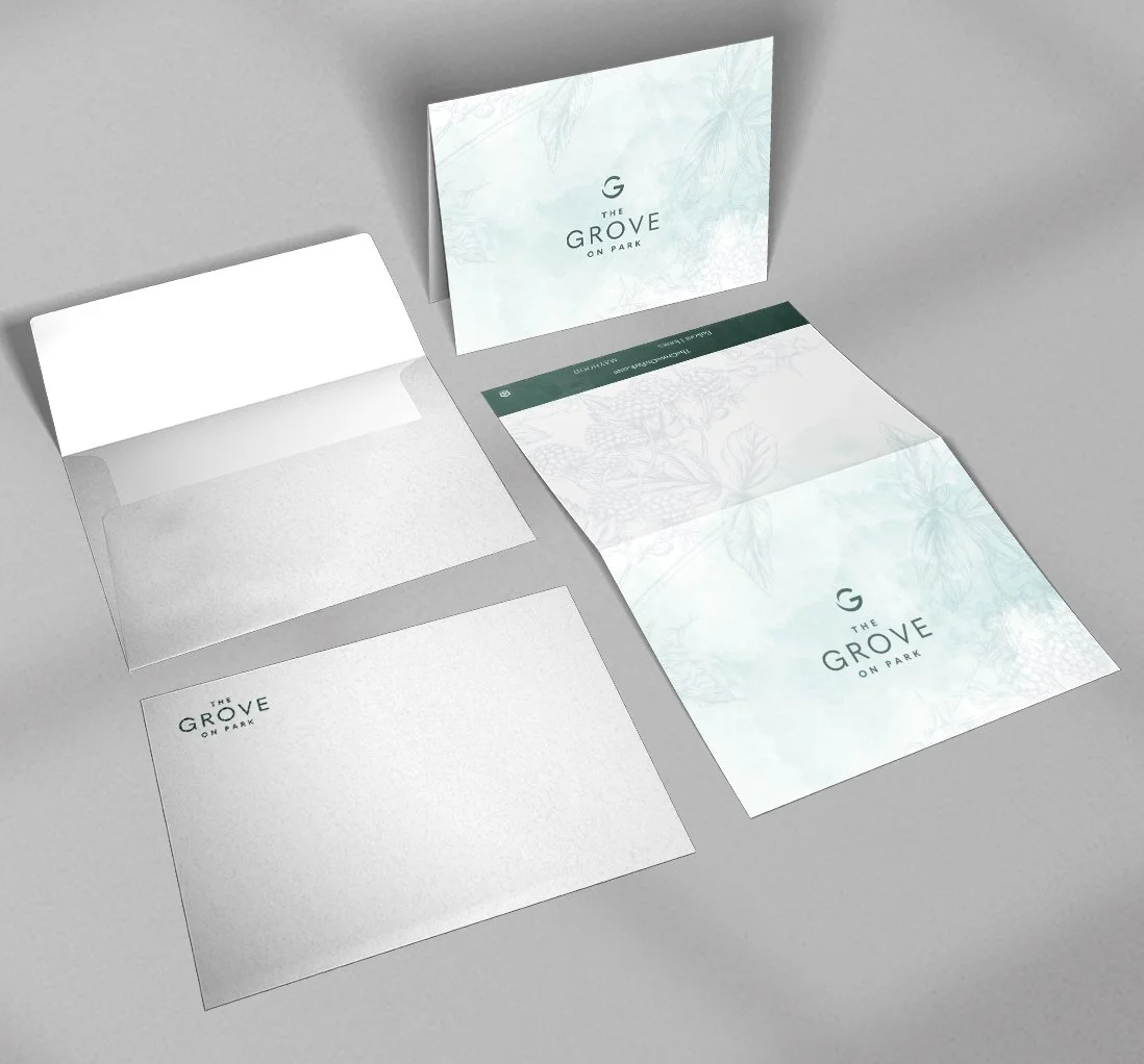
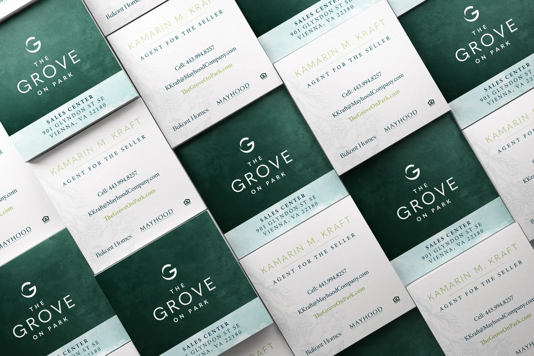
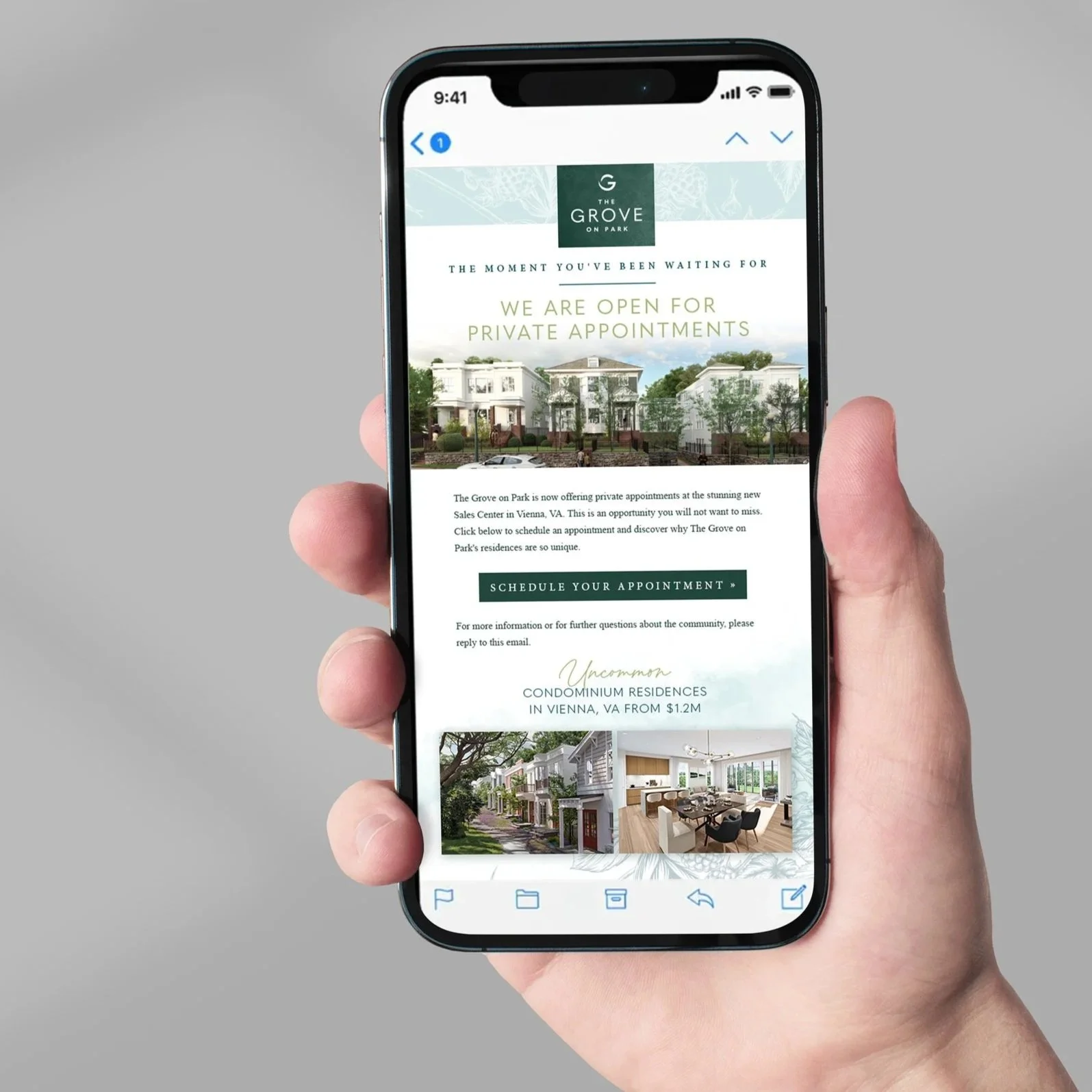
Logo & Brand Identity
This logo and branding project for new, unconventional condominiums offered exploration how best to pair a soft, organic identity with a logo that is not overtly feminine, but is bold, connotes luxury, and has an icon that can stand alone—all important goals indicated by client direction.
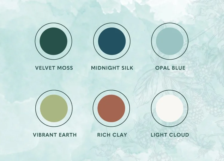
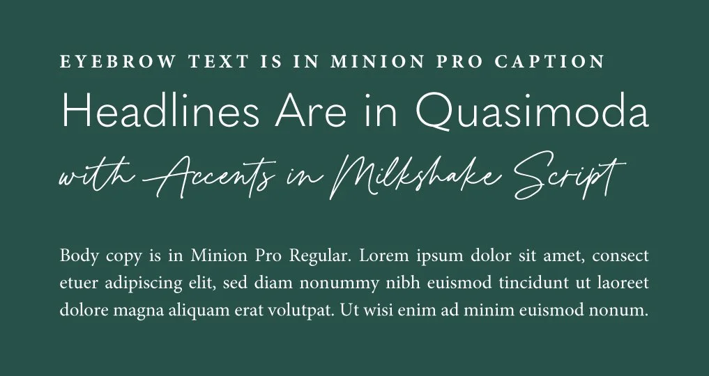
The color palette, brand textures, patterns parallel nature, and are meant to inspire everyday life. The saturation of the brand’s colorways contrasts the more muted tones often chosen to represent nature; creating a varied palette allows for versatility in execution and delivers a refreshed appearance. Pairing these elements with a clean, neutral, but strong logomark allows room to showcase a natural, human connection.